Data Is Beautiful (18 Charts & Graphs)
I love a good graph or chart. It’s truly fascinating to see someone break down a ton of data and fit it efficiently into an infographic I, an idiot, can understand. Keep kicking ass, nerds.
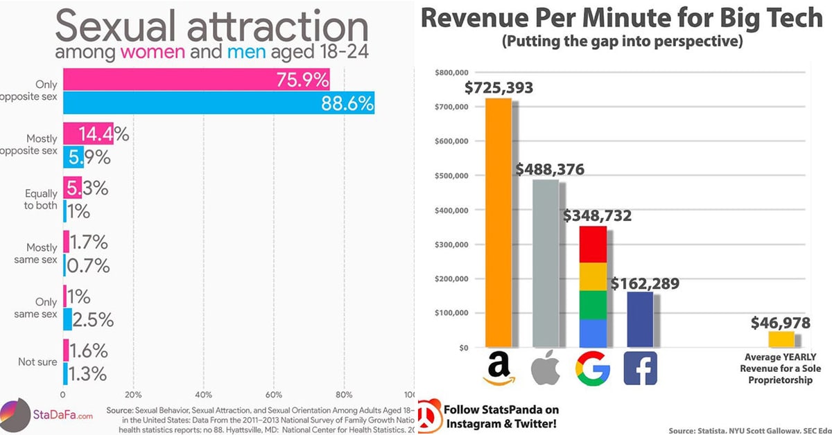
1. Sexual attraction among women and men aged 18-24

2. Do you like Indian cuisine? These are the most frequently used spices to get the right flavor and these shall you buy to get the most bang for your buck.

3. Area Codes that rapper and actor Ludacris claims to have Hoes in.

4. There are 400 trees for every human on Earth.

5. Men associate “Sex” with “Happiness” more than women (survey of 1,147 men and women)

6. This morning, Zoom’s stock price tanked after Pfizer announced optimistic progress on their COVID-19 vaccine.

7. Children Waiting To Get Adopted In The U.S.

8. Revenue Per Minute for Big Tech

9. My GF’s Clothing Color Palette in October (damn, she likes blue a lot)

10. Distance to the horizon when viewed from different heights.

11. The states in blue have a combined total population equal to Los Angeles county, in red.

12. The yellow states in the map below are the states in which it is legal to own a RACCOON.

13. Distribution of SNICKERS letters in my Halloween candy.

14. States Kanye West Received Votes In.

15. Squirrel to Human Ratio by State

16. Share of young adults living with their parents.

17. Most Followed Twitter Accounts (as of Oct. 29th, 2020)

18. Size of things if they were the same density as neutron stars.

You may or may not also enjoy these high-quality links:
- People Are Sharing The Quirky Things They Actually Love About Americans (28 Pics)
- Just A Yuge List Of Tremendous Trump Memes From His First Term (30 Memes)
- The Results Are In, The ‘Me Voting In 2016 Vs. Me Voting In 2020’ Meme Is Funny
- Twitter Reacts Hilariously To Joe Biden Becoming The Next President Of The United States (21 Tweets)
- Election Anxiety Tweets To Ease Your Mind (21 Tweets)