Data Is Beautiful (42 Photos)
Data is beautiful if you take the time to put it all together correctly. Sometimes, it adds up to something pretty. Numbers are for nerds! I like my information visual. That’s why I watch the news. I want to see a video clip of the thing I should be angry about today. Don’t make me read! That’s what Twitter is for. And my stack of erotic paranormal romance novels.
Frankly, I’m a dumb person. I blame myself. I know more about a map in Super Metroid than any map of the Earth. That’s why I’m happy people on Reddit gave me data that is digestible and fun to read. I hope you enjoy it as much as I do.
Here are the best examples of maps and graphs that became pieces of art simply by crunching some numbers:
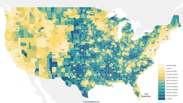
1. Percentage of housing units in the United States that are under $100,000.
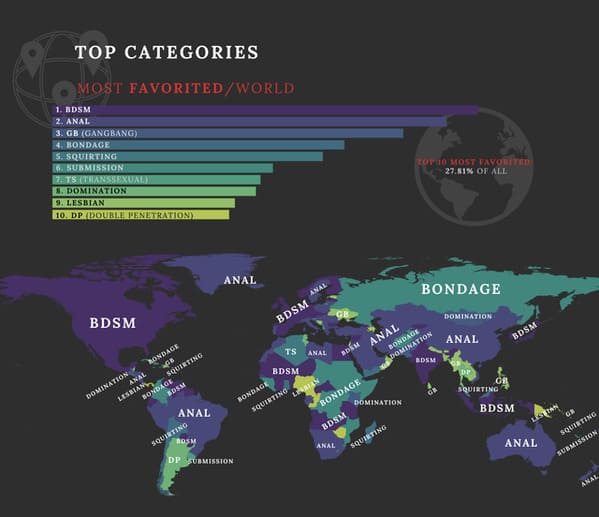
2. The most popular kink by region of the world.
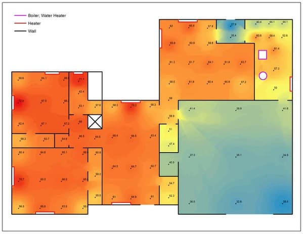
3. The varying temperatures of one man’s house.
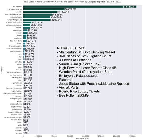
4. Value of items intercepted by US Customs.
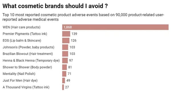
5. Bad graph for Wen.
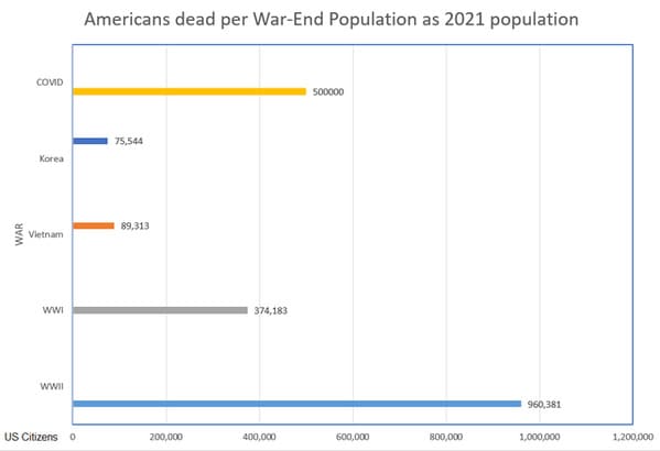
6. American COVID deaths versus the deaths during wartime.
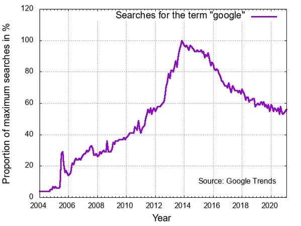
7. A graph of people Googling “google.”
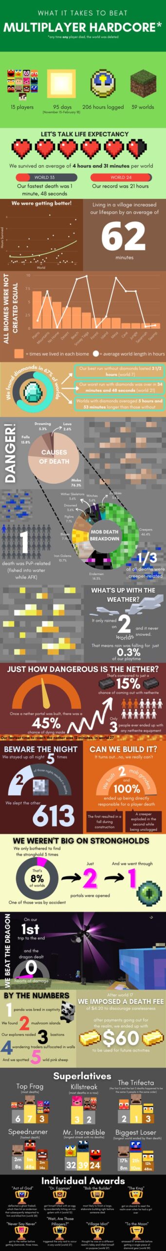
8. What it takes to beat hardcore mode in Minecraft.
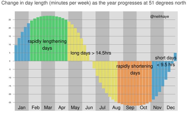
9. The light at the end of the tunnel in graph-form.
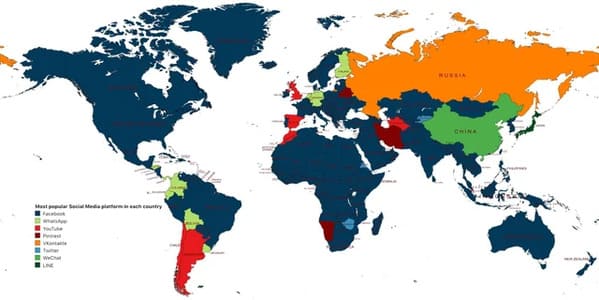
10. Favorite social media app by country.
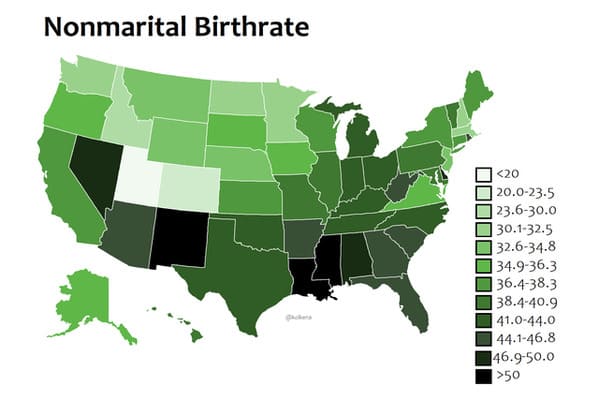
11. Children born out of wedlock by state.
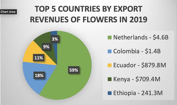
12. Countries that print money by selling flowers.
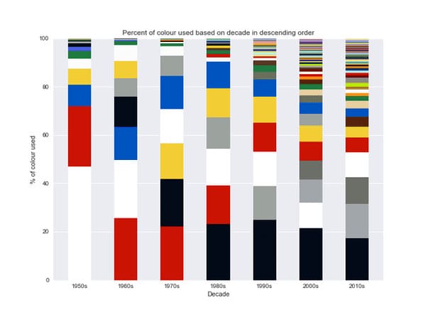
13. LEGO colors by decade.
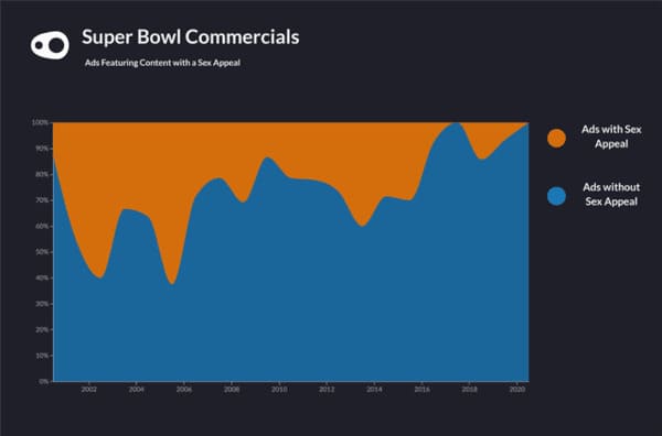
14. Ads with and without sex appeal.
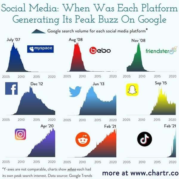
15. Popularity of social media sites as told by Google searches.